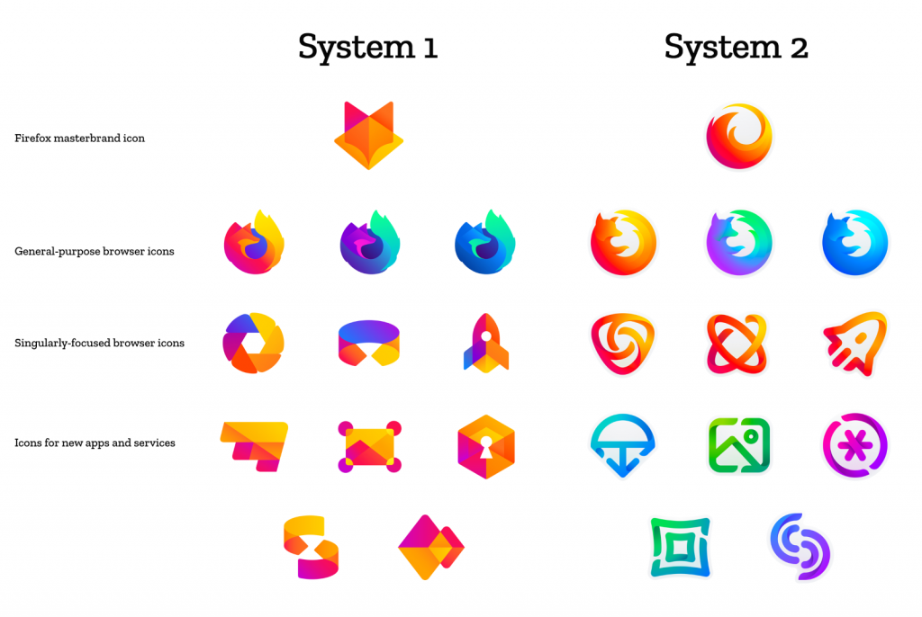
Mozilla is asking the Internet to give feedback on some possible Firefox logo replacements. It’s either the “foxy” version or the “swooshy” version.
Not even a year has passed since Mozilla has launched the latest simplified logo for their Quantum-branded versions of Firefox and the designers have already come up with a new – this time – set of icons.
Madhava Enros, who is senior director of Firefox UX, and Tim Murray, who is the creative director, mentioned in a blog post on Mozilla’s official website that they are trying to go beyond the simple web browser that can be found nowadays on most laptops and mobile devices, as “there’s more to the story now and our branding needs to evolve”.
“As an icon, that fast fox with a flaming tail doesn’t offer enough design tools to represent this entire product family,” they added. “Recoloring that logo or dissecting the fox could only take us so far. We needed to start from a new place.”
To start with, Mozilla came up with two “master brand” icons that can be reinterpreted and rejiggered into a range of other versions to represent their software and services. While the first master brand represents a stylized fox head, the second one represents a circularly curving flame. The two rebrand ideas were named “System 1” and “System 2” and both of them include three general-purpose browser icons (Stable, Nightly and Developer), three singularly-focused browser icons (Focus, Reality, and Rocket) and other icons for their upcoming projects.
This time, though, the decision is not in the hands of Mozilla employees only, as the company is asking for users’ feedback onto which one of the two systems of new icons would fit best the concept and culture of Firefox.
Those who wish to express their opinion related to the two versions of master brand logos can do so by leaving a comment on this blog post on the official Mozilla website. Worth mentioning is also that there’s a set of questions that users who wish to help might want to take into account when leaving their comments:
- Do these two systems still feel like Firefox?
- How visually cohesive is each of them? Does each hold together?
- Can the design logic of these systems stretch to embrace new products in the future?
- Do these systems reinforce the speed, safety, reliability, wit, and innovation that Firefox stands for?
- Do these systems suggest our position as a tech company that puts people over profit?
“With your input, we’ll have a final system that will make a Firefox product recognizable out in the world even if a fox is nowhere in sight,” the Mozilla designers said.


